My Roles
- Art Direction
- Brand Direction
- UI/UX Design
- User Research
- Visual Design
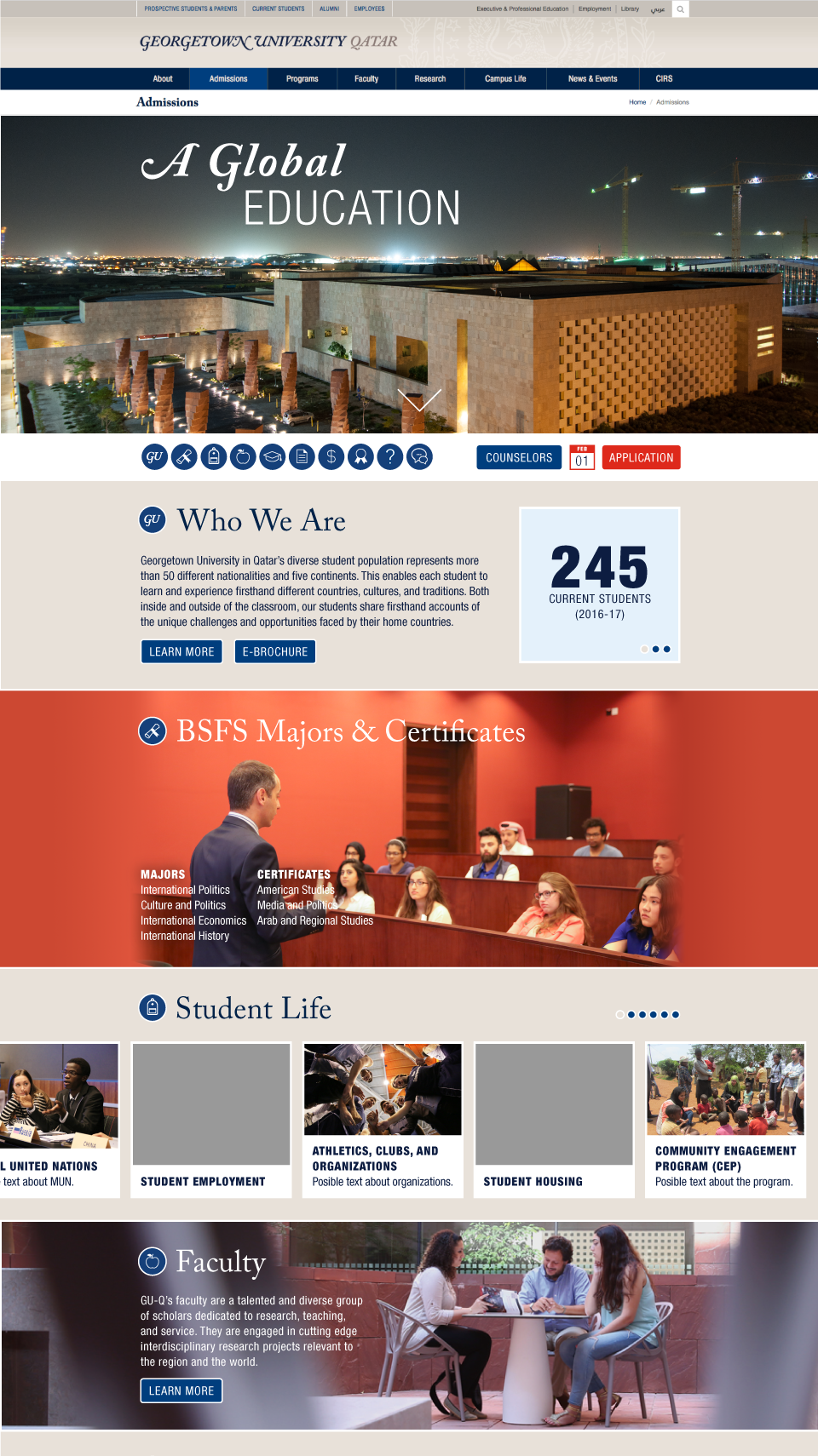
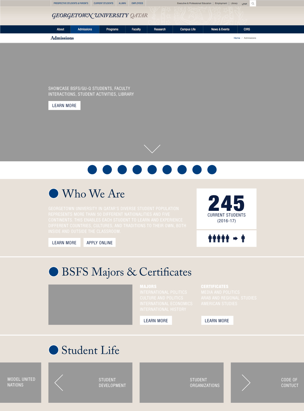
Admissions Homepage
A robust online resource, giving potential students and their parents access to everything they need to know about the university.
View Website
Problem
Admissions team members felt unable to keep up with the constant flow of incoming questions about the university and were looking for new, time-saving ways to provide answers to potential students.
Solution
In my role as designer, I partnered with the developer on my team to plan, design, and develop a robust new online resource that empowers users to find the information they seek without having to ask for help.
Research + Planning
In my study of the existing website, I found that a majority of the most sought-after content was sprinkled throughout the site, making it difficult to find. To improve this experience, we needed to:
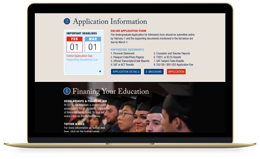
- gather all admissions-related content and put it in one easily accessible place
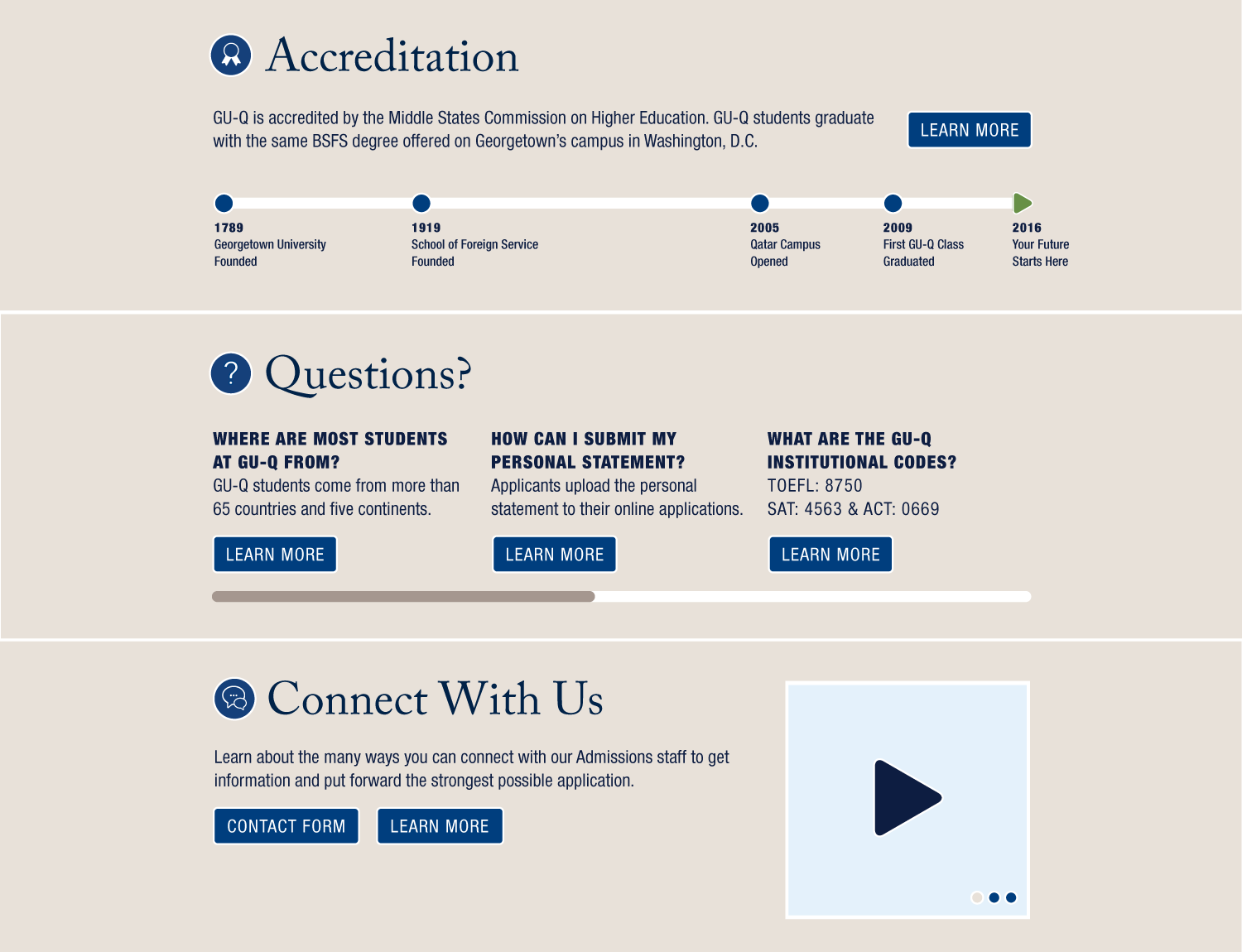
- provide answers to as many frequently asked questions as possible
- organize new and old content in an intuitive and meaningful manner
- market to potential students (and their parents) and convince interested students to apply
Analyzing the Competition
Similar institutions in Qatar organized admissions content differently, but offered more or less the same amount of information. By studying the websites of larger institutions that, by nature, contained more content, we identified creative new ways to group content.
User Focus Group
To better understand our target audience, we conducted a focus group. We gathered 30 current students and asked them questions about their experiences during the admissions process.
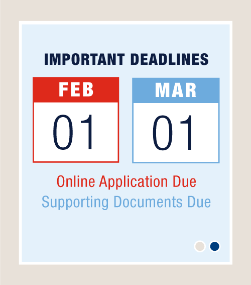
66%
of students said they were confused or uncertain about when the application was due.
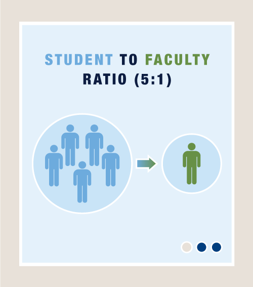
84%
of respondents said they considered the academic and non-academic aspects equally when deciding where to apply.
72%
of respondents said they found descriptions and images of daily life in Qatar helpful.

User Tasks + Flows
Because this new design was for a page within a larger website, we needed to create a way for visitors to find content without excessive scrolling or searching. Beginning with our newly identified content groups, we created a secondary navigation system and used it to develop user tasks and flows, helping visitors:
- skip directly to the content they are looking for
- discover essential university information by scrolling through strategically grouped content
- learn more about a particular subject via links to other pages within the larger website
- feel more comfortable and have a better understanding of the university
Iteration + Implementation
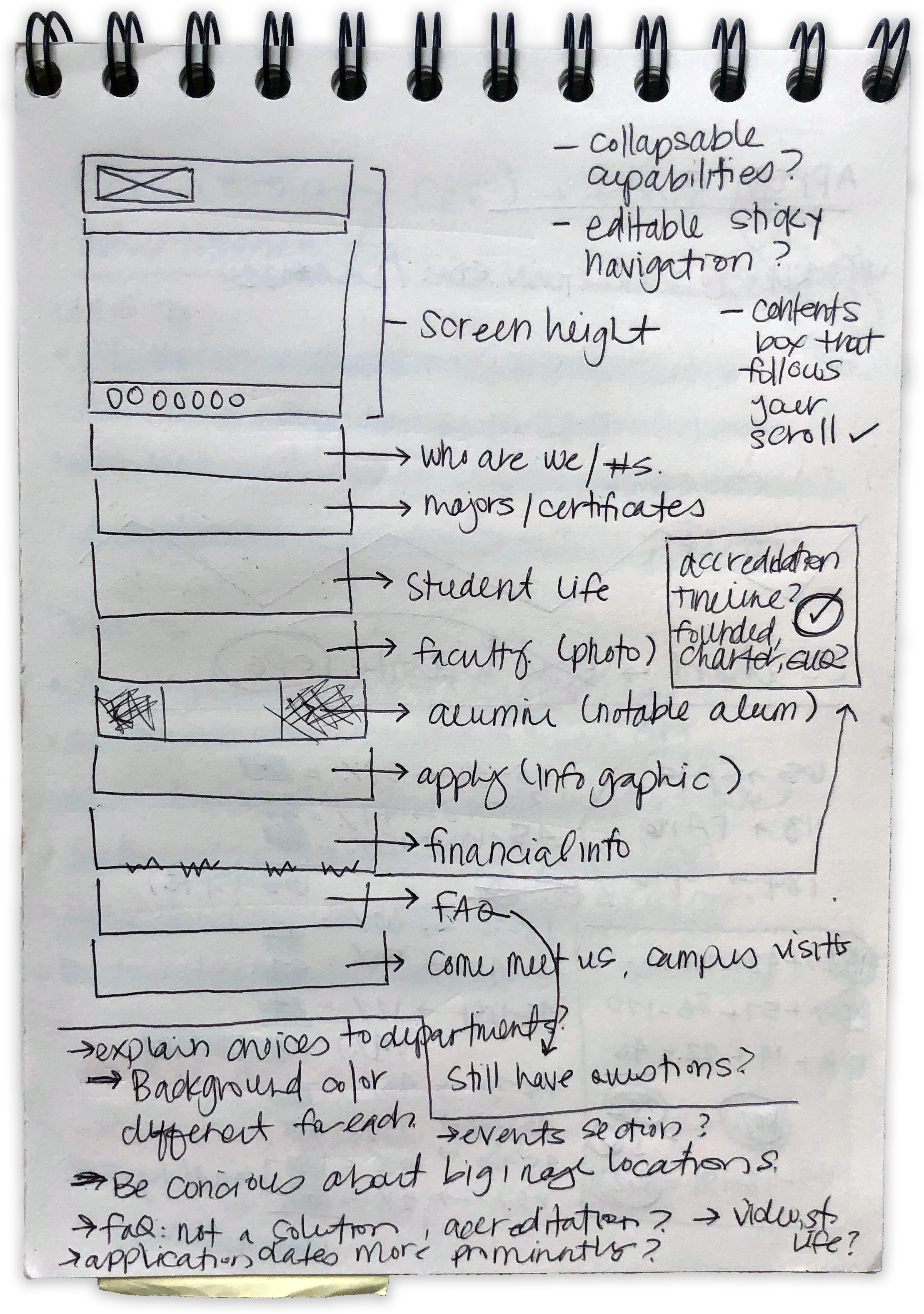
Sketching + Wireframes
Beginning with quick hand-drawn sketches, I developed high-fidelity wireframes that helped give the admissions team a visual representation of the work we'd done so far. Discussions about the order of sections, imagery, and functionality guided the iteration process.
Branding + Identity
Following the Rules
As a product of the university, the look and feel of the website needed match the existing brand, so all of my design decisions had to be made within the boundaries of the visual identity system.
Establishing a Style
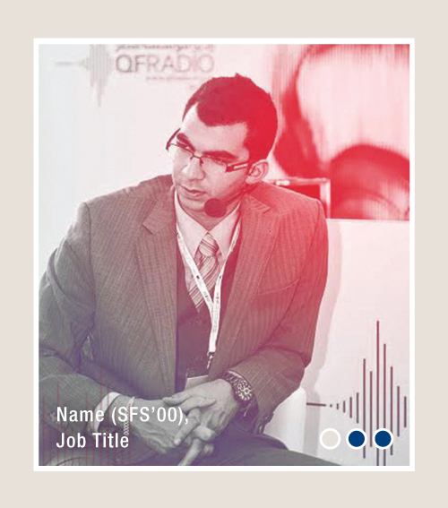
Keeping the diverse target audience in mind, I opted for a neutral background, used colors to guide the user from one section to the next, and highlighted the most important content with brief infographics.
Execution + Development
Website Development
After iterating and sharing multiple versions of high-fidelity wireframes with the admissions team, I handed the final designs and approved assets off for development.
View Website
Conclusion
The purpose for this redesign was to provide the maximum amount of accessible information to the target audience and, though the credit can’t all be attributed to the new website, the university had its highest application and admission rate of any year since the school opened in Qatar.
The university site was redesigned in 2020 and, without question, what we learned during this process gave the admissions team a head-start when it came to planning their new page. Team members were able to make informed decisions and set goals based on feedback from real users to create an even better resource for potential students.