My Roles
- User Research
- UI/UX Design
- Branding
- Visual Design
- User Testing
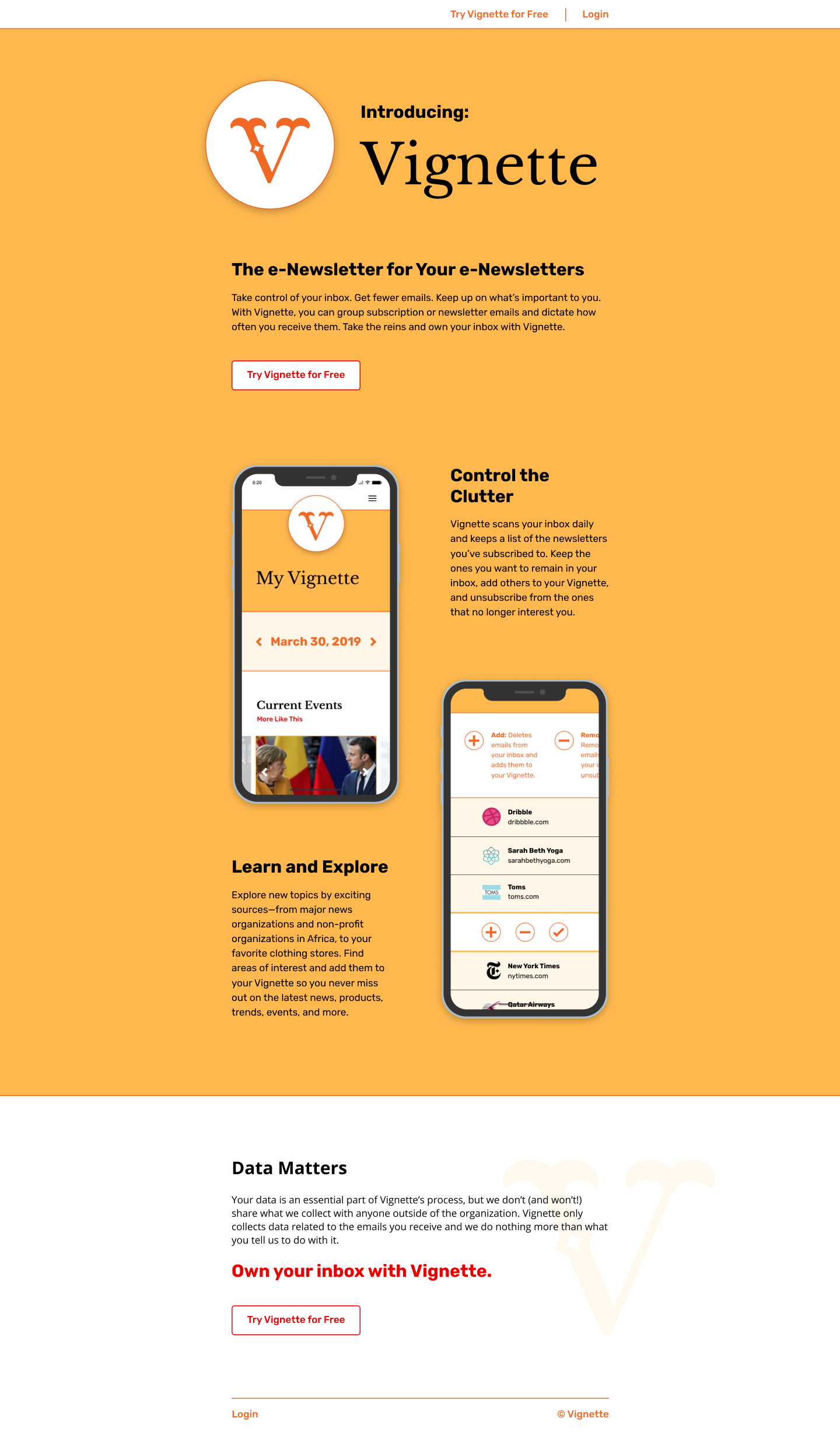
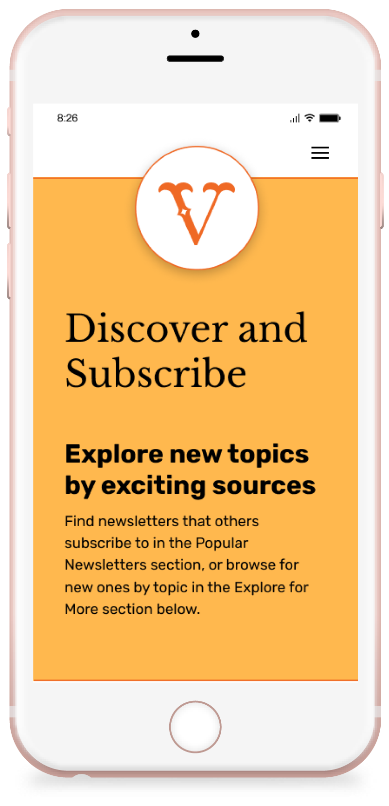
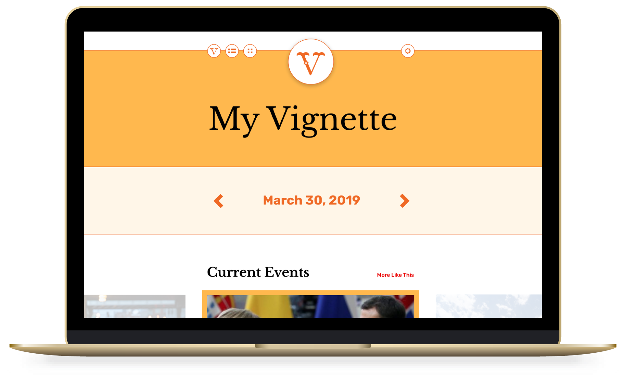
Vignette
Vignette is an e-newsletter roundup service that scans, organizes, and shares with its users the most important stuff in their inboxes via a single email.
View Prototype
Problem
The average person receives too many emails to keep up with the pace at which they're being shared, so a major portion of emailed content, relevant as it may be, isn't reaching the end user.
Solution
Vignette organizes user-prioritized emails and presents them to users in a simple, consumable way. It's an e-newsletter for e-newsletters and a way to connect users to content, without all of the usual hassle.
Research + Planning
Building an MVP
For product success, the very basic version of Vignette needed to:
- filter and organize incoming email subscriptions using preferences specified by the user
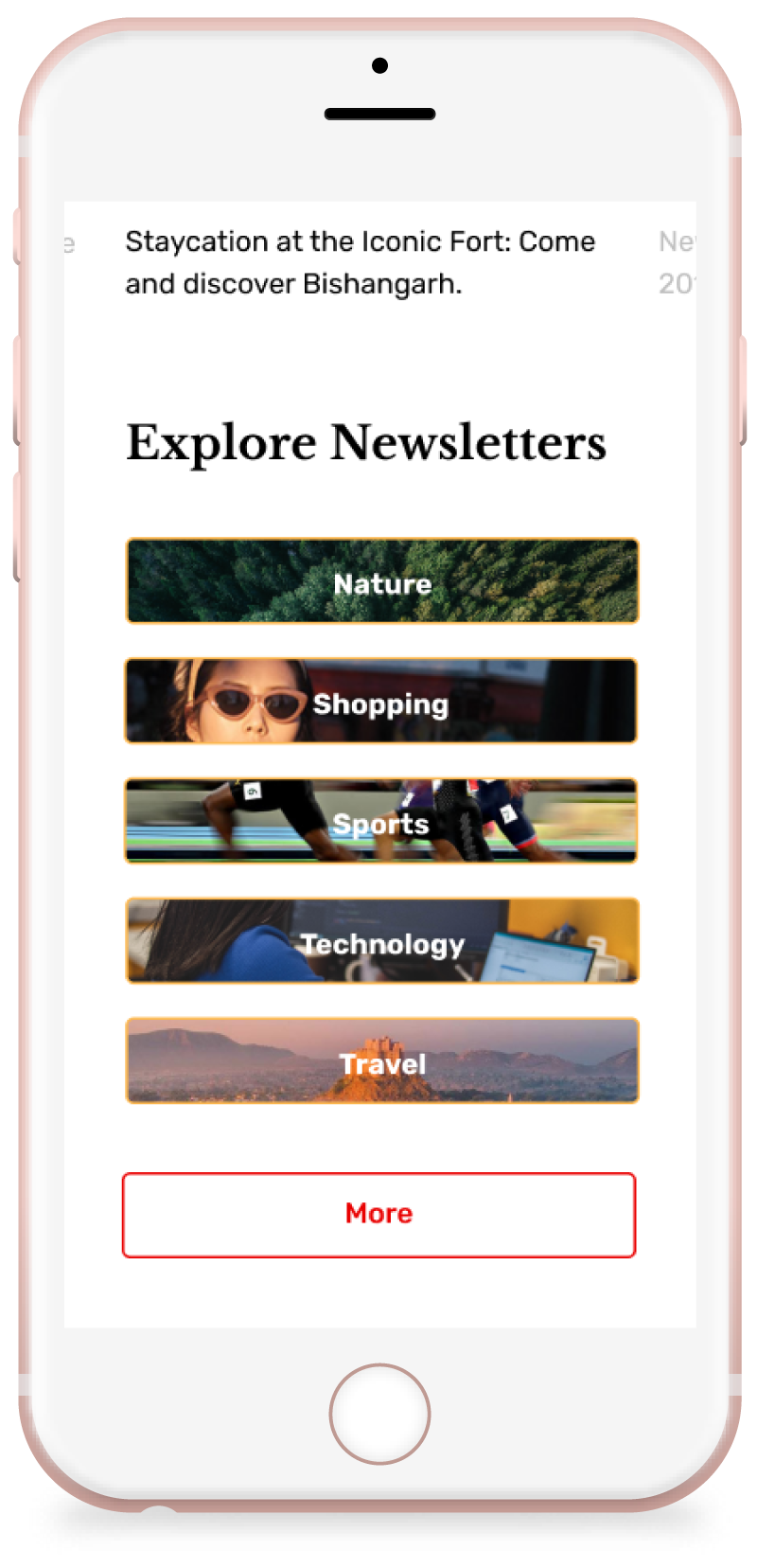
- suggest additional e-newsletter content, based on user-selected interests
- thoughtfully present user-prioritized content in the form of a single weekly e-newsletter
Analyzing the Competition
Though not a direct competitor, the Apple News app's clean, organized, and user-generated method for sharing content was the original inspiration for Vignette. By studying two additional brands that approach the issue of email subscriptions in very different ways, an opportunity to combine existing ideas and create a brand new product emerged.
>> View Competitive AnalysisSurveying Users
Survey responses to the following questions confirmed assumptions that were made about user relationships with subscription emails:
- do you read all of the e-newsletters you receive?
- are the e-newsletters you receive effective?
- do you have trouble unsubscribing from emails?
75%
of survey respondents said most of the e-newsletters they receive are not effective.
88%
of survey respondents said they delete e-newsletters without reading them.
60%
of survey respondents said the e-newsletters they receive are long and sent too frequently.


User Personas
Vignette's target market, as illustrated by personas James, Sara, and Susan, reveal similar goals through varied frustrations. Potential users want:
- to reduce the number of emails piling up in their inboxes
- quality, rather than wasted, time online
- to stay up-to-date on current events, news, family, friends, and other interests
High-Priority User Tasks
Converting target market goals into tasks, Vignette's top four needs are:
- access to user inboxes
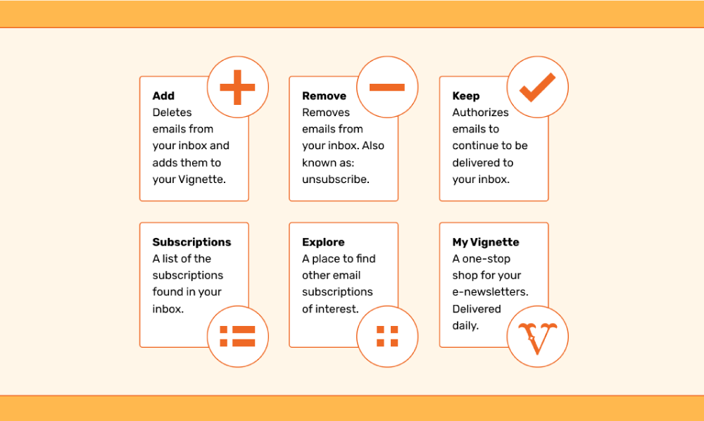
- the ability to add or remove emails from user inboxes
- the ability to unsubscribe from user-specified subscriptions
- access to new subscriptions/content
Information Architecture
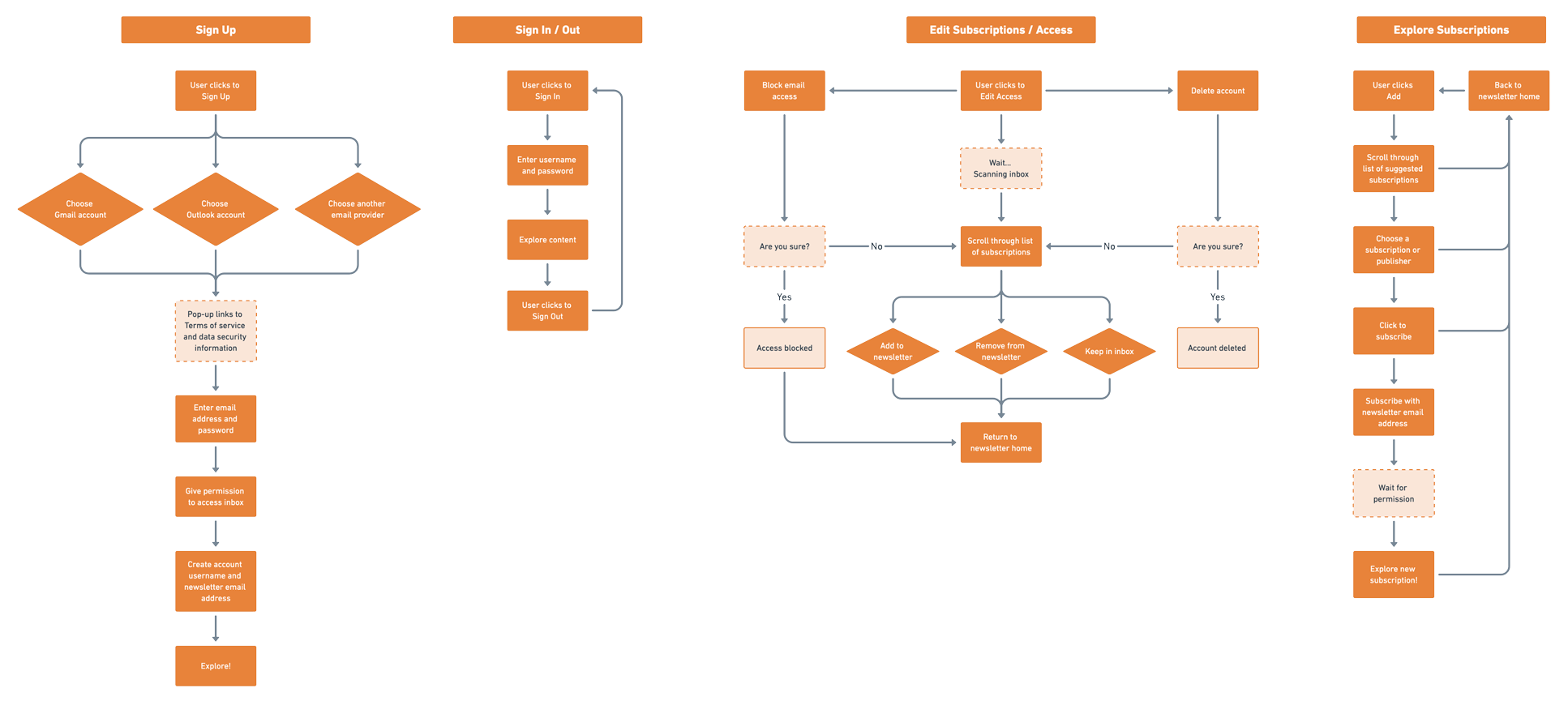
Sitemap + User Flows
Keeping Vignette's users at its center, the sitemap consists of just four basic sections—onboarding, subscription and explore, account settings, and the newsletter itself. Based on these sections, the following user flows guided Vignette's structure:
- create/sign up for an account
- sign in/out of user accounts
- filter (add, remove, or delete) email subscriptions
- explore new content
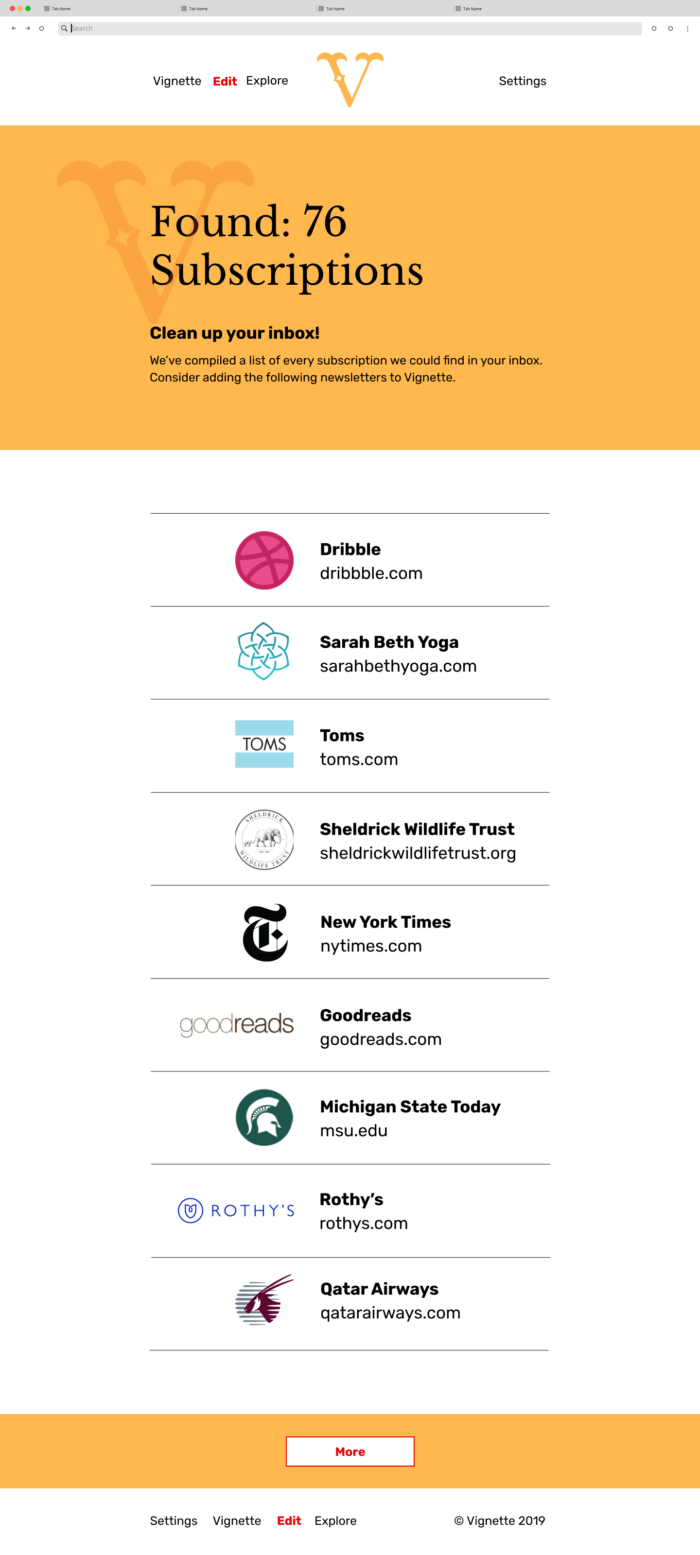
Wireframes + Initial Testing
The process of wireframing began with hand-drawn sketches which were refined in Figma and then shared with potential users for feedback. Crutial user stress areas became clear during this initial testing phase.
>> View Wireframes and Mockups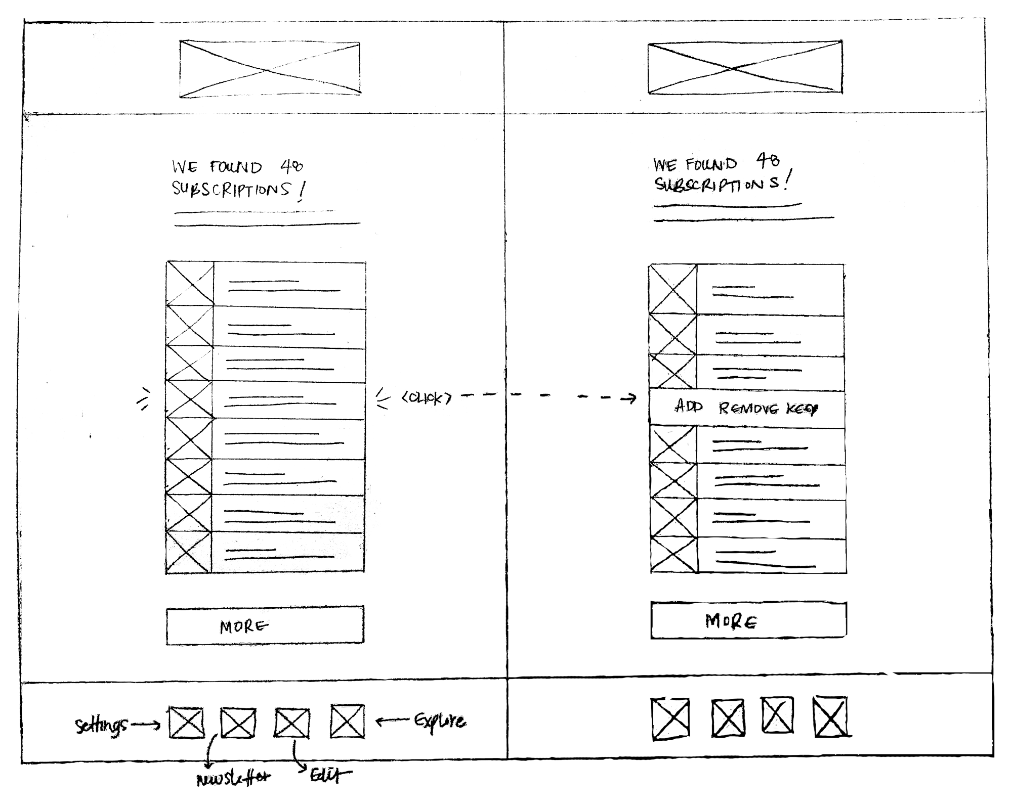
Brand Development
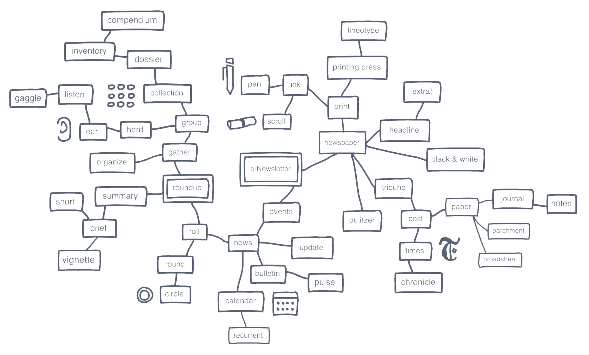
Branding Brainstorm
The word 'Vignette' came out of a branstorming exercise and corresponds directly to the project's ultimate goal—to create a simple, brief account of email subscriptions for users.
Logo + Style Guide Creation
Taking the chosen brand name into account, early logo sketches explored the varying definitions of the word 'Vignette'. The most successful marks were A/B tested and a style guide, establishing rules for typography and color, was built around the user's selection.
>> View Style Guide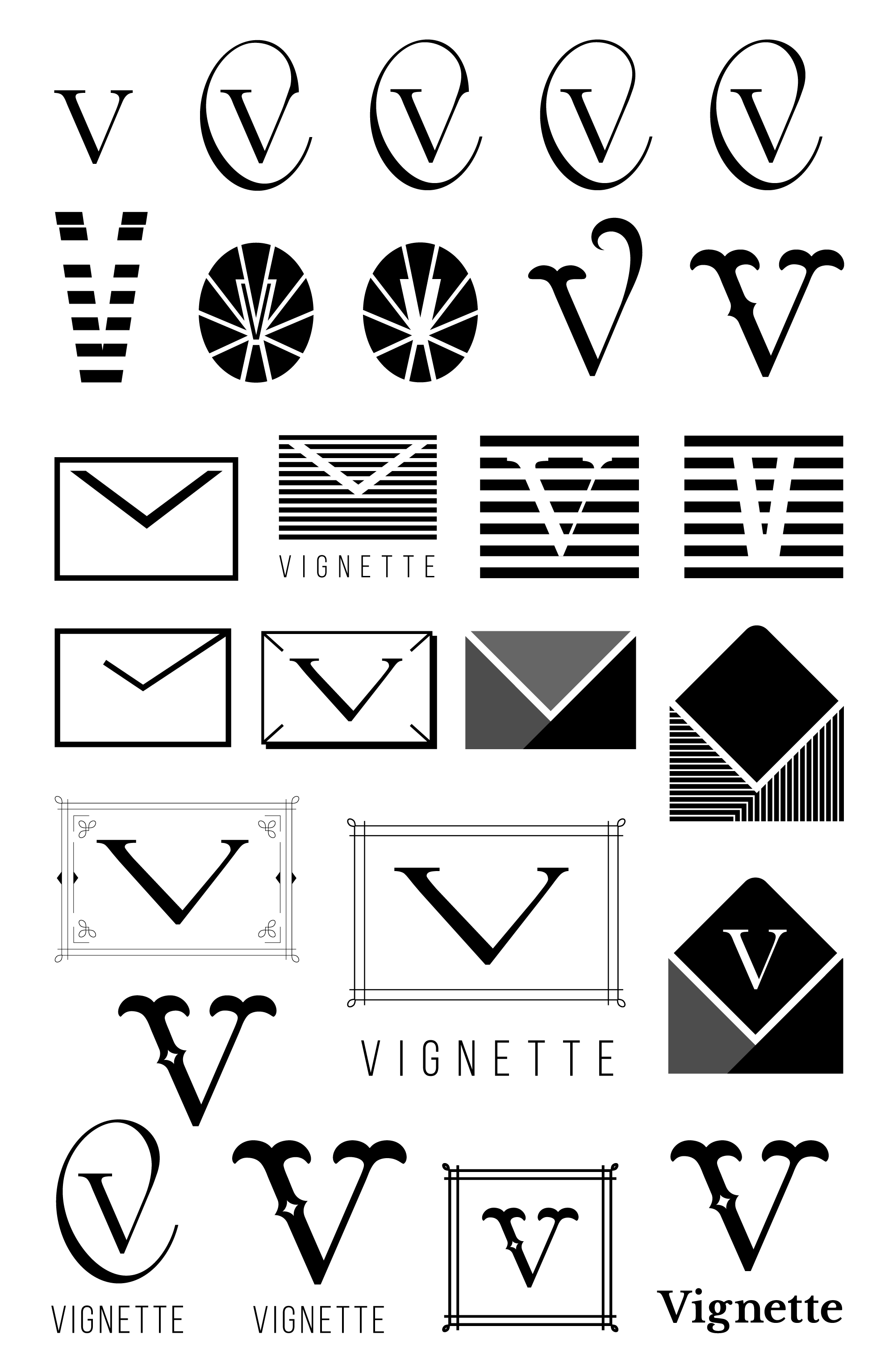
Execution + Testing
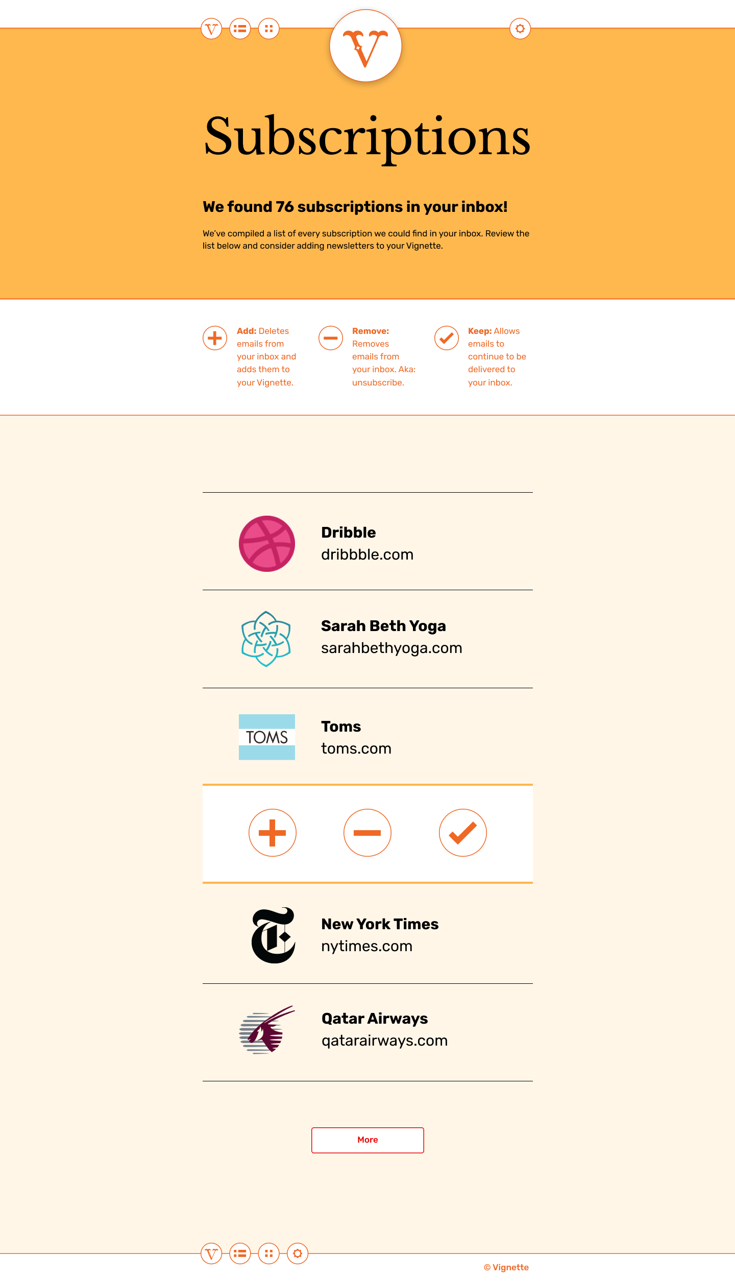
Design Mockups + User Testing
Pulling branding work and user research together, I created design mockups and tested them with potential users. The user tests highlighted instances of oversimplification and identified areas for improvement. A few of the most significant updates were:
- reordering items and adding iconography to the navigation bar
- clarifying Vignette's purpose for new users by improving the tagline on the homepage
- making fewer list items visible on each page
- adjusting the line-length, overall hierarchy, and font sizes on each page
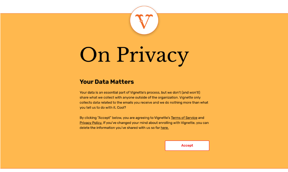
Onboarding Preference Test
To guage potential users' thoughts on app tutorials, two onboarding experiences were presented to users for feedback.
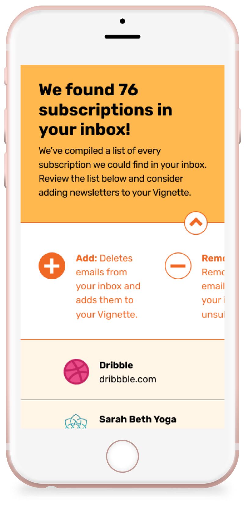
- Dismissed: jumping straight from the sign up/login pages to the Vignette-generated list of user subscriptions
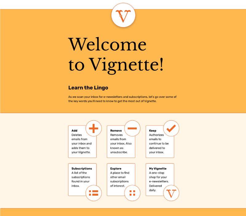
- Implemented: requiring users to agree to privacy settings and review an explanatory welcome page before getting to their subscriptions list
Completing the Prototype
In addition to the sticking points identified on Vignette's top-level pages, users asked questions about potential second-level pages. Rather than letting them wonder, new pages were mocked up and added to the final prodotype to illustrate those experiences.
View Prototype
Conclusion
Vignette was born out of frustration and, with a better understanding for what users actually want when it comes to subscription emails, has the potential to change the way users with email fatigue consume content.